Why Dark-Theme Effects Look Messy in Light Mode
while building a landing page for a small open-source library, i designed the dark theme first. for the light theme, i started by swapping the palette
technically, nothing broke, but the page looked dirty.

the problem wasn’t just the palette. it was that the dark design relied on simulated light (neon glow, bright gradients) and CRT-era artifacts (RGB channel offsets, scanlines). on a pale background, those effects became stains and noise.
the rule i ended up using was:
not literally, of course. the same screen renders both. but for this redesign, treating dark as luminous hardware and light as ink on paper made the choices obvious:
- button glow became shadow and ink bleed
- RGB fringe was reworked into a color-registration outline
- scanlines and background haze disappeared to reduce visual noise
- hover changed from “more light” to “more ink”
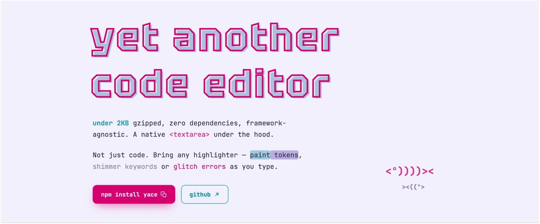
some effects needed translation. others had to go.
i had to build the bad version before this became obvious.
when an effect works in one theme but feels wrong in the other, ask: what is it pretending to be and does that thing belong in the new theme?